This blog is the visual diary of my drawings, paintings and sculptures. Along with a large collection of photorealist and hyperrealist artists. It can be used as a tutorial blog, or just as inspiration to create your own artworks. Please respect copyright laws. Thank you - Tom Mulliner.
Visit http://www.tommulliner.com for any inquiries or to contact me.
I have added some more of my favourite photorealist and hyperrealist artists to my ever growing list, originally posted in November 2009: THE BEST PHOTOREALISTS/HYPERREALISTS LIST
7 new additions: Matthew Cornell An American landscape artist that paints some beautiful scenes with stunning lighting.
Juan Gallego A Spanish artist depicting extreme close up images of plants and flowers on a very large scale.
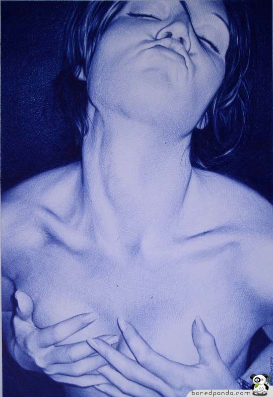
Aaron Nagel A figurative artist from Oakland, that paints images that resemble a fashion shoot with controversially religious undertones.
James van Patten Landscape artist from New Jersey, specialising in scenes of an aquatic nature.
Lee Price American figurative artist, with a distinctive bird's-eye-view perspective.
Jaime Valero Figurative artist, specialising in bath and shower scenes.
Pamela Wilson An American figurative artist with a slight theatrical dress theme.
I have added some more of my favourite photorealist and hyperrealist artists to my ever growing list posted in November 2009: THE BEST PHOTOREALISTS/HYPERREALISTS LIST
I have added the following artists so far this year: Juan Francisco Casas - figurative artist that mainly uses biro.
Sam Jinks - sculptor, often quite disturbing works.
Evan Penny - sculptor, famous for producing distorted figure sculptures.
Cesar Santander - artist often depicting antique tins and toys.
Josep & Pere Santilari - two twin Catalonian brothers that paint figures and still life.
My latest drawing is a reworked version of 'Bowl of Cherries' in charcoal, pastel and graphite. 13"x10". The original version was rushed a bit and I always felt that it could have been better. At first glance the two look very similar, but with a closer look the difference is more obvious. (As always - click on the images to enlarge in a new tab).
A spin off from the 70's 'photorealist' movement, 'hyperrealism' is a movement dedicated to being 'more real than real'. To not just copy a photograph in paint, but to add or create an element that not would be evident from looking at a photograph. It might be a reaction, emotion or thought that just a photograph would not envoke.
Below is an excerpt from"A Brush Stroke for Every Human Suffering" - Ari Siletz, Media Watch about the below painting by Denis Peterson.
"This instance of hyperrealism is a performance art. Viewers are deliberately made to notice the amazing amount of time and painstaking effort that went into portraying this Darfur refugee. Peterson isn't showing off; he is a radical painter, compelling us with his dedication. The astonishing realism is the result of every wrinkle and twist of hair being colored and shadowed in the context of reflected light from every other object in the scene. Whereas the camera does this mindlessly as a matter of optics, this artist has endured whatever it took to make sure human eyes do not respond as mindlessly. We can flip the page on a Newsweek photo, worth a click of the camera, but we can’t as easily turn away from such an extraordinary labor of compassion."
16"x23" Watercolor and watercolor pencils on paper
Tom Martin - Wholewheat Acrylic on panel 100cm x 100cm
Pedro Campos - Oil on canvas 116cm x 89cm
Simon Hennessey - The Duality of Colin Acrylics on board 60 X 160 cm 2008
Raphaella Spence -Impressions 2008
oil on canvas 95 x 127 cm
Randy Ford - Mixologist Oil on canvas 26"x14"
Luciano Ventrone: Aureolin oil on linen 60 x 70 cm
As you can see, they are truly hyperreal! I never knew that one could paint so realistically. However, if you think about it, of course one can! It's just a series of colours arranged in a certain pattern; the same as a photograph is. It's the 'exactness' that makes them different to regular paintings. The exact colours, tones and brushwork. Some use watercolours, some use acrylics and airbrushes, some use oils; the results are just as breathtakingly amazing as each other.
These two drawings were made as a thank you present for two kind ladies from my local library that saved me a lot of money. I won't go into details but let's just say it involved 6 library DVDs and my car roof! :-p
Pencil on paper. H, 2B and 4B plus a blending stump. I'm quite pleased with the cherries, but quite a bit less so with the strawberry. I think it needs more contrast. (Too late now of course as i don't have them anymore). The strawberry is also a redo as I botched up my first attempt by trying to add chalk pastels for colour having completed a full tonal drawing as you see here. So don't try that one! I wonder what the cherries would look the size of a watermelon!! I think I'll give that a go some time. I've always had a great urge to paint a still life of fruit, but overly massive. An apple 3m x3m for example! I have a 1m x 1m canvas waiting beside me here for a first go.
This post is not a tutorial I'm afraid as I didn't photograph it in progress. However, it is another painting I've been working on recently and deserves to go up here.
The painting is of a Protea Cardinal flower, which I believe is a native flower of South Africa. It was lying around at my mother's house when I went to visit her last month, and so I photographed it for future reference. It's oil on canvas and quite large being 16" across by 48" high. (Intended to be upright, it works on it's side too)! I originally bought the canvas for a panoramic landscape.
So here it is: (click on the image to enlarge) The photo doesn't really do it justice, so I will take some more piccies outside tomorrow when the sun comes out.
(WORKS STILL IN PROGRESS 02-08-09: A Series of four and a commission for some apples). So Stay tuned!


.gif)


.jpg)


